The problem
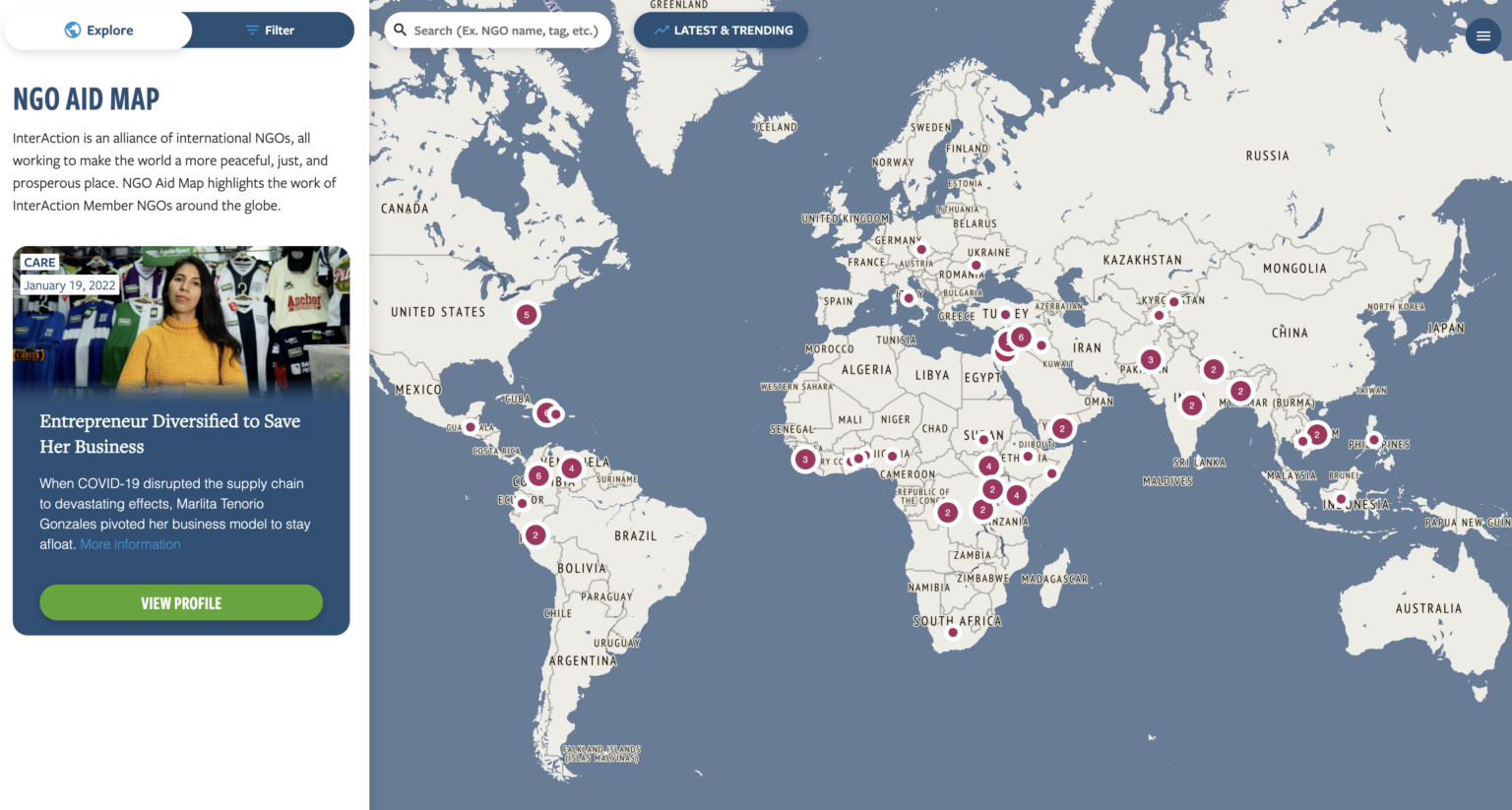
NGO Aid Map was built to show where InterAction's members were working. Over three years, members had uploaded fewer and fewer projects. Meanwhile, public systems such as IATI and the UN's Financial Tracking Service already compiled deep records of active aid projects.
A redesign that only made the map prettier would have kept asking members for data they had stopped providing, to duplicate records that already existed elsewhere.
How I worked
I led InterAction's team through three human-centered design practices: building empathy with the people who use the map, defining the right problem before solving it, and looking at the whole system of aid data rather than the map alone.
Who the map is for
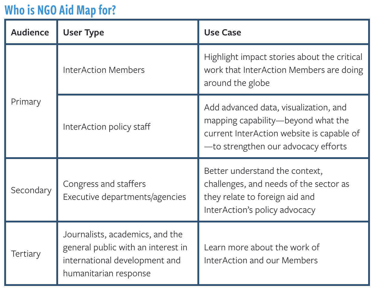
Research sorted the map's audiences into three tiers, each with its own use case. InterAction's members and policy staff came first. The secondary audience was the one InterAction's advocacy is aimed at: Congress and its staffers, and executive departments and agencies. Journalists, academics and the interested public came third.
The key decision
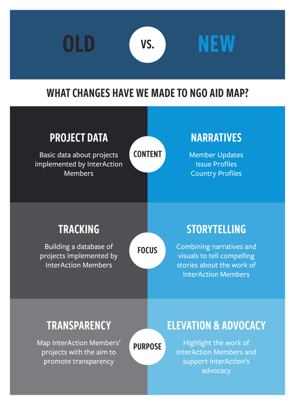
Stop duplicating project records. Rebuild the map around two jobs: showing the alliance's impact and supporting its advocacy.
That changed the content, the focus and the purpose of the whole site. Project data gave way to narratives: Member Updates, Issue Profiles and Country Profiles.
The redesigned map
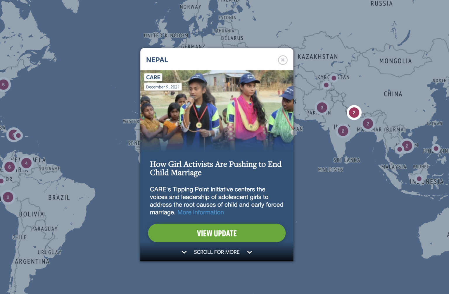
Member Updates are short stories pinned to the map and clustered by country. Opening a cluster shows the member organization, the date and the story, with a path to the full update.
Testing the prototype
I ran two rounds of task-based usability tests on the clickable prototype: five sessions in February 2021 and three in March 2021, each with a participant from a different user type. I logged every task as no issue, remark, minor, moderate or serious, and paired each pattern with a recommendation for the InterAction and Taoti teams.
| What we saw | What changed |
|---|---|
| Using both "Story" and "Update" for the same thing confused people. One participant hit a serious issue over it. | Recommended one name for member content: Member Updates. |
| Most participants struggled to find Trending Stories in round 1. | Reworked Latest and Trending; all round 2 participants found it. |
| "Explore" read as vague. In round 2, two of three preferred "Spotlight". | Recommended "Spotlight", the label most testers preferred. |
| Participants expected filters to "Apply", not "Save". | Flagged the button label for the build team. |
| People wanted to know how current a country page was. | Recommended a "Last updated" date on country pages. |
Outcome
The redesigned NGO Aid Map launched in 2022. It helped InterAction's members coordinate their response to COVID-19, putting the alliance's work in one place for members, policymakers and the public.